Pocket Creatives is a London photography and video production business. We built a visual showcase that brings its films, photography and creative services into a confident, connected browsing experience.
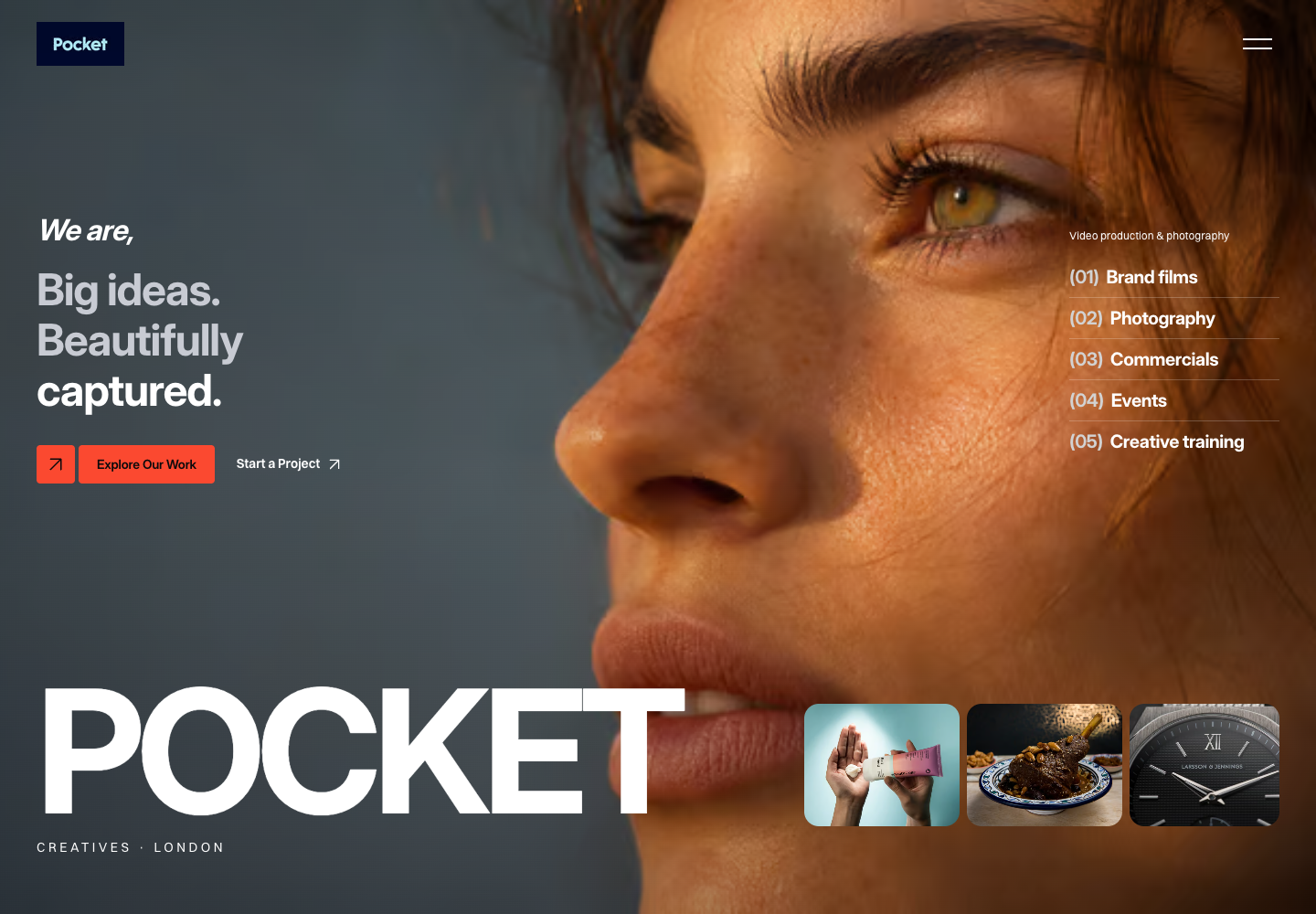
The redesigned homepage · Desktop capture, 8 November 2026.
Business
Pocket Creatives
Sector
Photography & video production
Location
London
Our work
Website design & development
The challenge. Let the work speak.
A creative production website has two jobs: show the quality of the work and help a potential client understand how to start a project. Pocket Creatives offers brand films, commercials, event coverage, photography and creative training.
The original website already explains those services and includes projects, testimonials and production information. The design challenge was to bring that existing offer into a more immediate visual story, with a clear hierarchy and purposeful routes to the work and contact pages.
Large-scale photography, expressive typography and a restrained dark palette give the creative work space to make an impression. Orange accents draw attention to actions, while a compact navigation keeps the opening view focused.
The homepage connects the studio introduction, services, selected projects, production process and showreel. Visitors can explore the creative work or move directly to a project enquiry.
From inspiration to a clear brief.
The design introduces what the team makes, shows how it works and gives prospective clients a route to the next conversation.
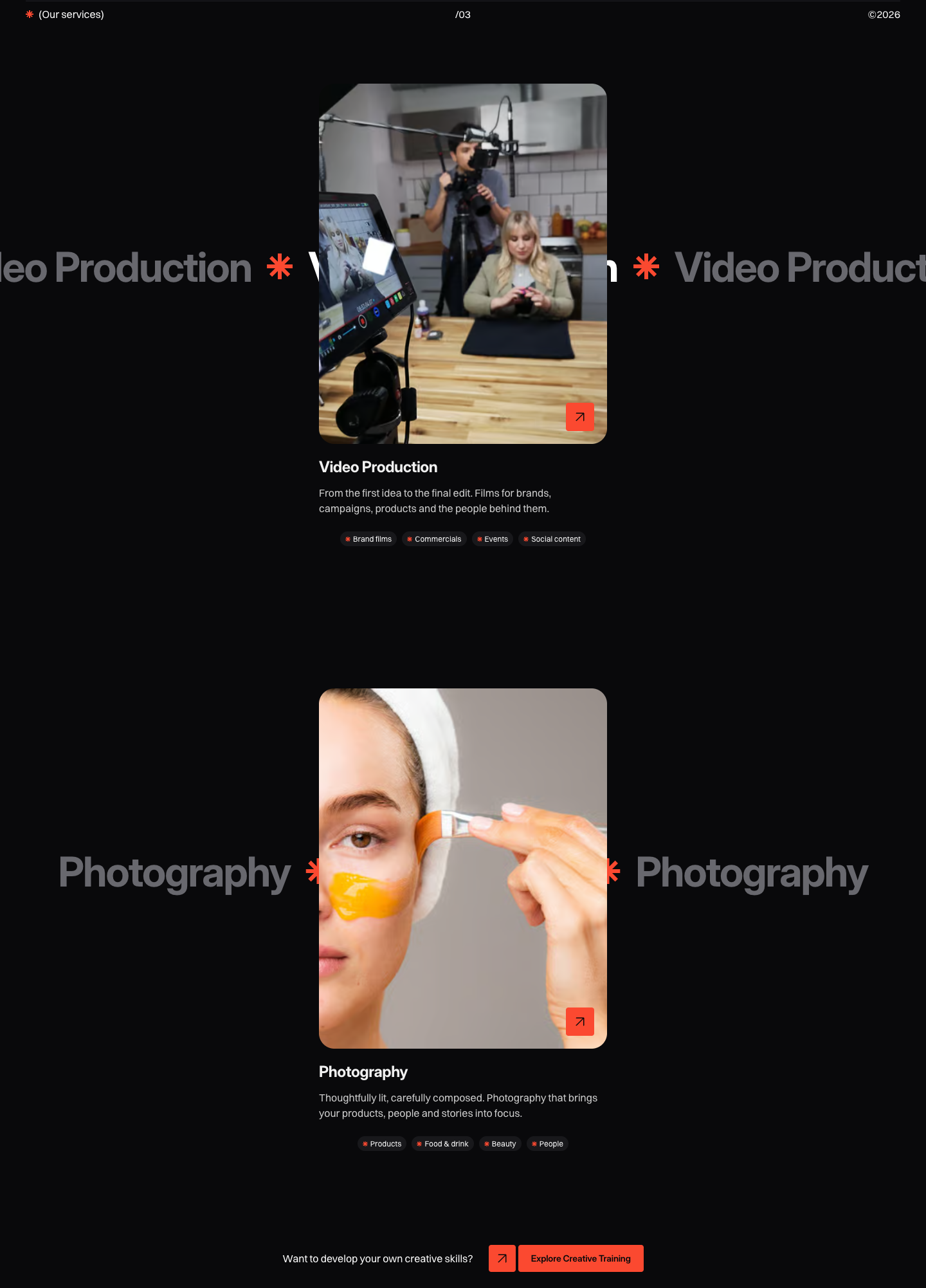
Video production and photography have distinct introductions, example imagery and links to more detail. Service labels help visitors recognise the right fit, from brand films and events to product, food and beauty photography.
The service sections connect creative imagery with practical service choices.
Make the process approachable.
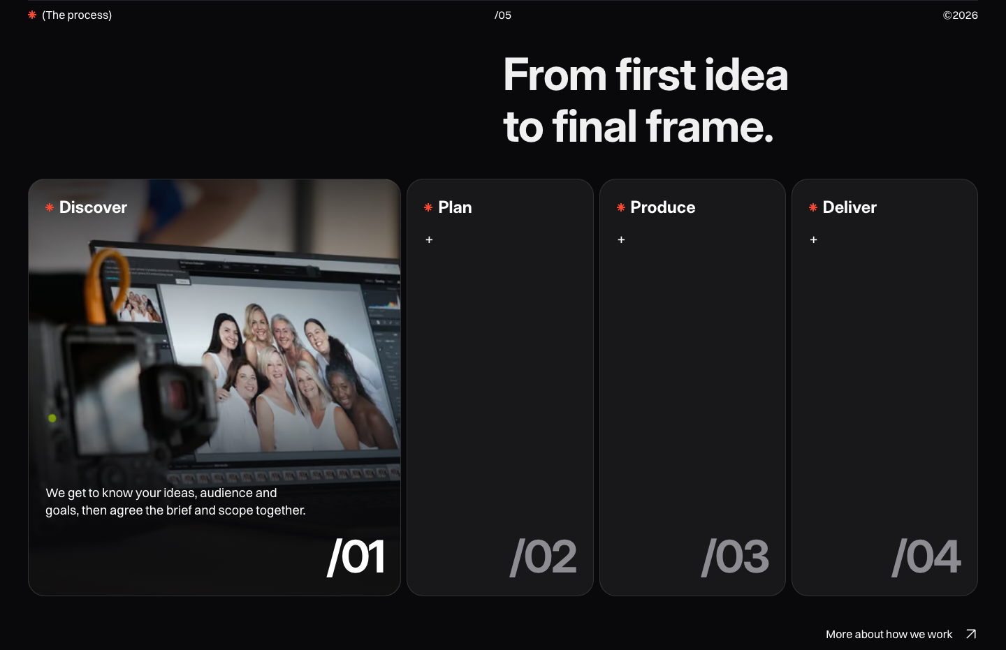
Discover, Plan, Produce and Deliver explain the journey from an initial idea to the finished work. The expandable stages let visitors explore the process without leaving the homepage.
An interactive introduction to the production process.
The same identity. A smaller canvas.
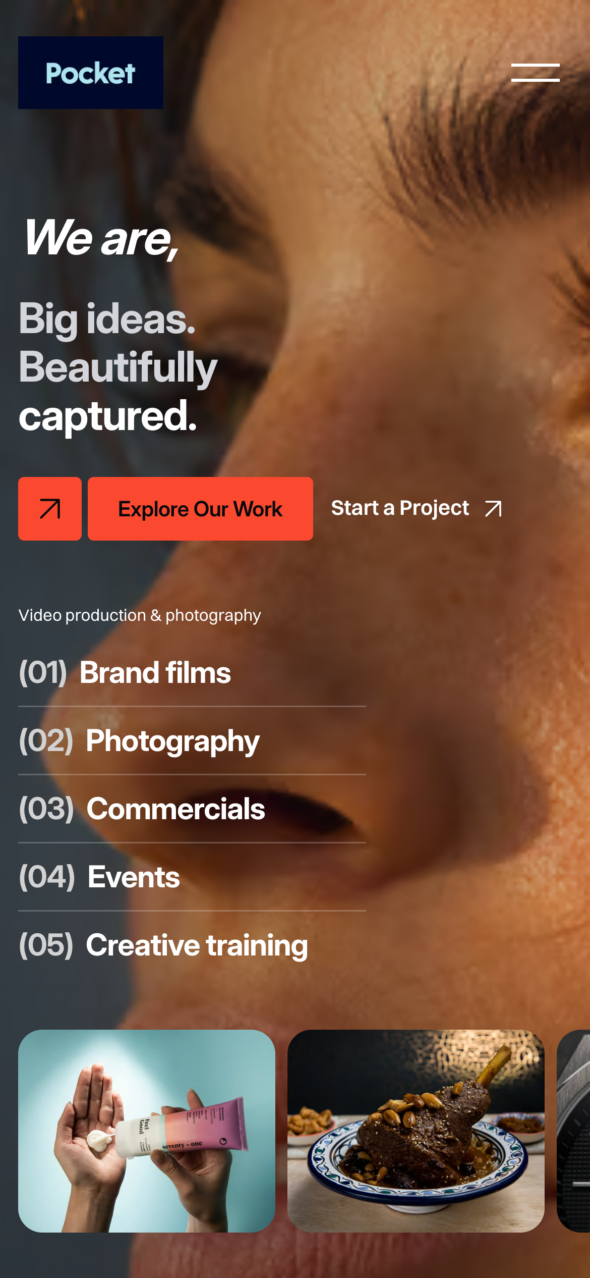
The mobile homepage keeps the photography, service categories and project actions together in a vertical composition. Compact navigation leaves room for the work itself.
This preview was captured at a 390 × 844 CSS-pixel viewport. Select any screenshot to open it at full size.
Redesigned homepage · Mobile preview.
The results. A more expressive showcase.
A distinctive first impression. Full-screen photography and a confident typographic hierarchy put creative production at the centre of the experience.
A connected introduction to the business. Services, selected work and the production process form a continuous route through the offer.
A clear invitation to enquire. Project links and contact actions give interested visitors an obvious next step.
These are design and browsing outcomes. Conversion, revenue and enquiry improvements have not been measured for this case study.